
Getting lost at a festival shouldn’t be part of the experience. Yet in a sea of brewery stands and crowds, finding your next beer can quickly turn into a frustrating search. For an event like Billie’s Craft Beer Fest, where discovery is the whole point, navigation isn’t just a convenience—it’s essential.
In many ways, a festival isn’t so different from a theme park or a shopping mall. Each is built around “attractions”: stores in a mall, rides in a park, and—at Billie’s Craft Beer Fest—brewery stands. Visitors move with intent, hopping from one point of interest to another, trying to make the most of their limited time. The challenge isn’t whether people want to explore—it’s how to help them get where they want to go.
The obvious answer is a map.
A map provides a visual overview of the space and anchors each attraction within it. But when the environment is indoors, crowded, and dynamic, a static map quickly falls short. That’s where the idea of an interactive map comes in—and why we set out to build one for the BCBF app.
The Limited Options
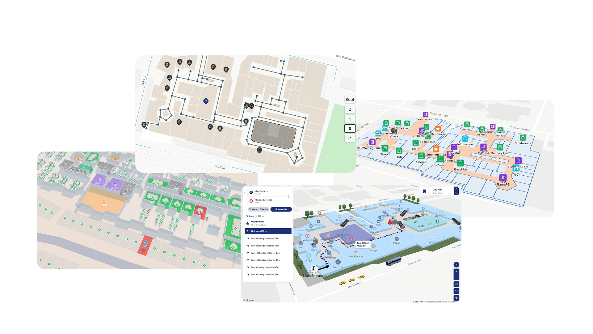
At first glance, building an indoor map might seem like a solved problem. After all, outdoor mapping has been refined for decades, with mature ecosystems like Google Maps, Mapbox, Apple Maps, and libraries such as Leaflet offering powerful, flexible solutions.
Indoor mapping, however, is a very different landscape.
Unlike their outdoor counterparts, indoor mapping solutions are far less accessible and often geared toward enterprise use cases such as airports, hospitals, or large commercial venues. Platforms like ArcGIS Indoors, MazeMap, MapsIndoors, and Mappedin do exist, but they typically come with significant barriers—closed ecosystems, sales-driven onboarding, or pricing models that don’t align well with short-lived events.
For a temporary setup like Billie’s Craft Beer Fest, these solutions introduce more friction than value. Long integration cycles, limited customization, and recurring costs make them impractical when working within tight timelines and constrained resources.
So what options remain when off-the-shelf solutions fall short?
You build your own.
The Requirements
A review of existing indoor mapping solutions reveals a number of recurring design patterns: a base venue layout, overlaid points of interest, and some form of spatial orientation for the user.
While these patterns provided a useful starting point, they needed to be adapted to the specific constraints of Billie’s Craft Beer Fest (BCBF). From this, a set of core requirements emerged.
Venue Structure
A common pattern in indoor mapping is the use of live location tracking to orient the user. In environments such as theme parks or large public venues, a “you are here” indicator becomes the primary navigation tool, continuously updating as the user moves.
In practice, however, this approach depends heavily on reliable positioning technologies—something that is far from guaranteed indoors. Within venues like Waagnatie Expo & Events, GPS accuracy quickly degrades due to structural interference such as concrete walls and dense crowds. Alternative solutions (e.g., Wi-Fi triangulation or beacons) introduce additional infrastructure and complexity, which were not feasible within our scope.
As a result, live location tracking was not a viable foundation for our map.
A second, widely used technique is to overlay a venue layout—typically an image or SVG—on top of a real-world map using tools like Mapbox, Leaflet, or Google Maps. Many indoor mapping solutions combine this with live tracking, using the overlay for structure and positioning data for real-time context.
Where most solutions treat this overlay as secondary, we made it central.
Our map relies entirely on the visual clarity of the overlay for orientation. By anchoring the indoor layout to a real map—but not depending on live positioning—we shift the responsibility from tracking technology to map design. The result is a system that is simpler, more predictable, and better suited to a temporary indoor event.
Points of Interest
Points of Interest (POIs) form the interactive layer of the map—the elements users actually navigate to. In most systems, these are tightly coupled to a single map instance, requiring full reconfiguration whenever the context changes.
For BCBF, this would introduce unnecessary repetition.
The festival returns to the same venue, meaning a large portion of the map remains stable across editions. To reflect this, we split POIs into two categories: static and dynamic.
Static POIs are tied to the venue itself. These include restrooms, emergency exits, and other infrastructure that rarely changes. By defining these once at the venue level, they can be reused across multiple editions without additional setup.
Dynamic POIs, on the other hand, represent the core attractions of the event—most notably the brewery stands. These change with every edition and are therefore configured separately and linked to a specific event instance.
This separation introduces a clear data model: a persistent venue layer combined with an edition-specific overlay. It reduces redundancy while preserving the flexibility required for yearly changes.
Cross-platform
Finally, the system needed to operate across two distinct environments: an administrative dashboard for configuring the map and a mobile application (iOS and Android) for end users.
This introduces a critical constraint: what is configured must match what is rendered.
Administrators need to place and manage POIs with confidence that their configuration will translate directly to the user experience. Any discrepancy between the dashboard and the app would increase complexity and introduce errors during event setup.
As a result, the mapping solution needed to be both portable and consistent across platforms. This requirement strongly favors technologies that can share logic, rendering behavior, and data structures between environments—minimizing duplication and ensuring a single source of truth.
From Requirements to Implementation
With these constraints in place, the question became less about what is possible and more about what is practical. Rather than adopting a full-fledged indoor mapping platform, we needed a lightweight foundation that we could fully control and adapt to our needs.
At its core, our approach still required a base map—something to anchor the indoor overlay and provide geographic context. This narrowed the field down to three realistic options: managed mapping platforms, native SDKs, and open-source libraries.
Choosing the Right Foundation
The first option was a managed solution such as Mapbox. While powerful and developer-friendly, it introduces an important trade-off: vendor lock-in. Even with a generous free tier, scaling the application—or increasing map usage—would eventually translate into recurring costs. For a system we wanted full control over, this was a significant drawback.
A second option was to rely on native map SDKs, primarily Google Maps. While this approach integrates well on mobile, it comes with its own limitations. In particular, support for scalable vector overlays (such as SVGs) is limited or inconsistent—an issue when zooming and maintaining visual clarity are core requirements. Additionally, this path once again ties the implementation to a specific vendor ecosystem.
This left us with a third option: Leaflet.
Although older than some modern alternatives, Leaflet offers something the others do not: complete flexibility without external constraints. It is lightweight, extensible, and—most importantly—gives full control over how the map is rendered and interacted with. For our use case, this trade-off was ideal.
Building a Custom Indoor Map Layer
With Leaflet as the foundation, the indoor map becomes a custom layer rather than a built-in feature.
The workflow we designed for administrators reflects this:
- Define the venue
The admin provides an address, which is resolved to a geographic location. This serves as the anchor point for the map.
- Upload the venue layout
An image or SVG representing the indoor space is uploaded. SVG support is particularly important here, as it allows the map to scale cleanly across zoom levels.
- Position and scale the overlay
The layout is placed on top of the base map and adjusted using geographic bounds. This step effectively “pins” the indoor space to the real world.
- Configure the default view
Initial zoom levels and viewport bounds are defined to ensure users immediately see a meaningful portion of the venue.
- Add Points of Interest
Both static and dynamic POIs are placed directly on the overlay, aligning with the data model described earlier.
From a technical perspective, this boils down to a relatively simple but powerful abstraction: an image overlay with interactive markers, all controlled within Leaflet’s coordinate system.
The WebView Hack
Up until this point, everything sounds fairly clean: a custom indoor map built on top of Leaflet, shared between admin and user interfaces.
And then mobile happened.
Leaflet doesn’t run natively in React Native. There’s no official support, no drop-in component, and rewriting the entire map using a native SDK would mean duplicating logic—and losing the consistency we had carefully built.
So we took a different route.
We cheated. Slightly.
Instead of porting the map, we embedded it.
HTML… inside a string… inside JavaScript
The core idea was simple: render the Leaflet map inside a WebView using react-native-webview. In practice, this meant constructing an entire HTML document as a string—yes, a literal string—and injecting it into the app at runtime.
It looked something like this:
export function buildLeafletHTML(payload: LeafletMapPayload): string {
  return `<!DOCTYPE html>
          <html>
            <head>
              <meta charset="utf-8"/>
              <link rel="stylesheet" href="https://unpkg.com/leaflet@1.9.4/dist/leaflet.css"/>
              <script src="https://unpkg.com/leaflet@1.9.4/dist/leaflet.js"><\/script>
            </head>
            <body>
              <div id="map"></div>

              <script>
                const map = L.map('map', {
                  center: center,
                  zoom: ${payload.defaultViewport.zoom},
                  minZoom: ${payload.defaultViewport.minZoom},
                  maxZoom: ${payload.defaultViewport.maxZoom},
                  zoomControl: false,
                  maxBounds: maxBounds,
                  maxBoundsViscosity: 1,
                  attributionControl: false,
                  zoomSnap: 0.1,
                  zoomDelta: 0.5,
                  wheelPxPerZoomLevel: 120,
                  fadeAnimation: true,
                  markerZoomAnimation: true
                });
              </script>
            </body>
          </html>`
}
It’s not pretty. But it works.
At runtime, all dynamic data—coordinates, image URLs, POIs—are injected directly into the string. The result is a fully functional Leaflet map, rendered inside the app as if it were a native component.
Bridging Two Worlds
Of course, rendering a map is only half the story. The real challenge is interaction.
This is where react-native-webview becomes surprisingly powerful. It allows two-way communication between the “web layer” and the native app.
When a user taps a POI inside the map, the WebView sends a message:
marker.on('click', function() {
    selectMarker(p.id, p.lat, p.lng);
    const msg = JSON.stringify({
      type:'poiPress',
      payload: {
        id: p.id,
        type: p.type,
        label: p.label,
        description: p.description,
        bgColor:p.bgColor,
        svgPaths:p.svgPaths
      }
    });

    if (window.ReactNativeWebView && window.ReactNativeWebView.postMessage) {
        window.ReactNativeWebView.postMessage(msg);
    }
});
On the React Native side, this is picked up and translated into application state:
const handleMessage = useCallback(
  (event: WebViewMessageEvent) => {
    try {
      const msg = JSON.parse(event.nativeEvent.data);
      if (msg.type === 'poiPress' && onPOIPress) {
        onPOIPress(msg.payload as POIPressEvent);
      }
      if (msg.type === 'mapPress' && onMapPress) {
        onMapPress();
      }
    } catch {
      // ignore malformed messages
    }
  },
  [onPOIPress, onMapPress]
);
This effectively turns the WebView into a controlled rendering engine: the map handles visuals and interactions, while the native app manages state and UI.
Hacky, but Honest
Is this approach unconventional? Absolutely.
But it comes with a powerful upside: we only had to build the map once.
The same Leaflet implementation powers both the admin dashboard and the mobile app, ensuring perfect visual consistency and eliminating an entire class of cross-platform bugs. The trade-off is a thin abstraction layer—HTML-in-a-string—that requires some discipline to maintain.
In the end, it’s a pragmatic solution: not the cleanest on paper, but highly effective in practice.
And sometimes, that’s exactly what you need.
Lessons Learned
Building an indoor map for Billie’s Craft Beer Fest turned out to be less about finding the “best” technology, and more about finding the right balance between control, cost, and complexity.
Looking back, would a more modern, fully managed solution like Mapbox have made certain parts easier? Probably. It offers a polished developer experience, strong tooling, and fewer rough edges when it comes to things like rendering and scaling.
But that convenience comes at a cost—both financially and architecturally.
By choosing Leaflet, we traded modern abstractions for full ownership. Every part of the system—from how the map is rendered to how POIs behave—remains under our control. There are no usage-based pricing concerns, no vendor constraints, and no hidden limitations waiting to surface as the application grows.
That decision also shaped how we approached the problem itself.
Instead of relying on live location tracking, we leaned into clarity of design. Instead of complex infrastructure, we embraced simple, composable building blocks. And instead of duplicating work across platforms, we accepted a slightly unconventional solution—the WebView—in exchange for consistency and maintainability.
Of course, this approach isn’t without trade-offs. It requires more upfront thinking, a willingness to work closer to the metal, and the occasional “hack” that wouldn’t exist in a fully managed ecosystem.
But in return, we ended up with something that fits our use case remarkably well: a fully custom, platform-agnostic indoor mapping system, built with minimal cost and maximum flexibility.
And perhaps that’s the most important takeaway.
The “best” solution isn’t always the most modern or the most feature-rich—it’s the one that aligns with your constraints, your goals, and the problem you’re actually trying to solve.
“Getting lost might be part of the charm at a festival—but with the right map, it doesn’t have to be part of the experience.”